
A painting can contain beautiful colours and skilful brushwork yet still feel confusing, weak or uncomfortable to look at. The reason is often composition: the way visual elements are selected, arranged and related within the picture. Composition gives a painting structure, helping the viewer understand where to look first, where to look next and how the whole image holds together.
Balance is one of composition’s most important principles. It does not always mean placing identical objects on opposite sides of the canvas. Instead, balance concerns the distribution of visual weight. Colour, size, shape, detail, direction, contrast and empty space all contribute to whether a painting feels stable, energetic, calm or tense. Understanding these ideas helps artists make deliberate choices rather than relying entirely on guesswork.
What Composition Means in Painting
Composition is the planned arrangement of visual elements in an artwork. These elements may include people, buildings, objects, trees, areas of colour, lines, shadows and spaces without detail. A composition answers practical questions such as:
- What is the main subject?
- Where should it appear on the canvas?
- How large or small should it be?
- What should the viewer notice first?
- How will the eye move through the painting?
- How do the shapes, colours and spaces relate to one another?
Composition applies to every kind of painting. In a portrait, it determines how the figure is positioned within the frame. In a landscape, it controls the relationship between sky, land, water and focal features. In an abstract painting, composition organises colours, marks, shapes and movement even when there is no recognisable subject.
A useful way to think about composition is to see the canvas as a designed field rather than an empty surface. Every mark occupies space and affects neighbouring marks. Even an apparently unimportant corner can influence the stability and direction of the entire image.
Understanding Visual Weight
Visual weight is the amount of attention an element attracts. A large object usually has more visual weight than a small one, but size is only one factor. A small, intensely red shape may attract more attention than a large, pale shape. Similarly, a sharply detailed object can compete with a larger area painted softly.
Elements tend to become visually heavier when they are:
- Large in scale
- Dark or strongly contrasted against their surroundings
- Highly saturated or bright in colour
- Complex, detailed or sharply defined
- Isolated by surrounding empty space
- Near the edge of the canvas
- Associated with recognisable forms, such as a face or human figure
Visual weight is not a fixed mathematical value. It depends on relationships within the painting. A dark tree on the left may balance a bright building on the right, while several small objects may collectively balance one large form. The artist’s task is to notice these relationships and decide whether the distribution supports the intended mood.
Types of Balance
Symmetrical balance
Symmetrical balance occurs when similar visual elements are arranged on either side of a central axis. This may be an exact mirror arrangement, or it may simply create a strong sense of equal weight. A formal architectural painting, a frontal portrait or a decorative pattern may use symmetry effectively.
Symmetry often communicates order, dignity, calm and stability. For example, a painting of a mosque, church, civic building or entrance gate may place the central structure directly in the middle, with related forms on both sides. However, perfect symmetry can become static if there is no variation. Small differences in light, texture or colour can preserve order while adding life.
Asymmetrical balance
Asymmetrical balance uses different elements that nevertheless have comparable visual weight. A large, pale area might balance a small, dark object. A cluster of several small forms may balance one dominant form on the opposite side. This is common in naturalistic landscapes, contemporary painting and visual storytelling.
Imagine a landscape with a large dark tree positioned in the lower-left corner and a distant group of bright huts on the right. The two sides are not identical, but the dark tree may balance the combined colour and detail of the huts. Asymmetrical balance often feels more natural and dynamic than symmetry because it suggests movement and variation.
Radial balance
Radial balance is organised around a central point, with lines, shapes or colours spreading outward. Flowers, wheels, circular arrangements of fruit and some decorative designs naturally encourage this structure. Radial compositions can direct attention strongly towards the centre, although the artist must prevent the outer areas from becoming disconnected.
Crystallographic or overall balance
In overall balance, no single area dominates completely. Similar marks, colours or shapes are distributed throughout the picture surface. Pattern-based, decorative and some abstract paintings may use this approach. It can create unity and rhythm, but it may provide a weaker focal point unless one area is given a subtle difference in scale, colour or detail.
Creating a Focal Point
A focal point is an area that receives the greatest visual attention. It is not always the largest object or the exact centre of the canvas. An artist can create a focal point through contrast, isolation, sharp edges, colour intensity, unusual placement or concentrated detail.
Consider a painting of a busy open-air market. Many baskets, fabrics and figures may be included, but a single customer wearing a deep blue garment could become the focal point if the surrounding colours are warmer and less intense. The eye notices the contrast before exploring the rest of the scene.
A strong focal point requires supporting and subordinate areas. If every part of a painting has equally sharp edges, intense colour and elaborate detail, the viewer may not know where to begin. Artists often use softer edges, quieter colours and simplified forms around the main subject. This does not mean that secondary areas must be boring. They should support the main idea without competing unnecessarily.
When deciding on a focal point, ask what the painting is trying to communicate. A landscape may focus on a glowing horizon, while a portrait may focus on the eyes. A still life may focus on the texture of a ceramic bowl rather than on every object present. The focal point should serve the subject and meaning of the work.
The Rule of Thirds and Other Placement Guides
The rule of thirds divides the canvas into three equal sections horizontally and vertically. The resulting intersections can be useful positions for a focal subject. Placing a horizon along an upper or lower third can also prevent the composition from being divided into two equal halves.
This is a guide rather than a law. A centred composition may be more appropriate for a formal portrait, while an abstract painting may deliberately reject regular divisions. The value of the rule is that it encourages the artist to test alternatives. If a subject is placed in the exact centre, compare it with versions positioned slightly to one side. Notice how the change affects energy, space and movement.
Other useful placement guides include diagonal arrangements, triangular structures, circular pathways and strong horizontal or vertical divisions. These are not formulas that guarantee a successful painting. They are ways of analysing how the viewer’s eye may travel through the image.
Balance Through Colour, Value and Contrast
Colour balance concerns the distribution of hues, temperature and intensity. Warm colours such as reds, oranges and yellows often advance visually, while cool colours such as blues and some greens may appear to recede, although surrounding colours can change this effect. A small area of warm colour can balance a larger cool area because it attracts attention more strongly.
Value means the relative lightness or darkness of a colour. A painting with too many equally dark areas may feel heavy and closed, while a painting with very little value contrast may appear weak or unclear. A dark focal object can be balanced by a lighter area elsewhere, but the result depends on size and surrounding contrast.
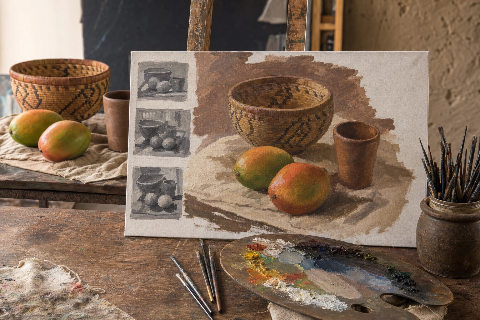
Before beginning a detailed painting, make a small black-and-white study, often called a value thumbnail. Reduce the subject to a few simple light, middle and dark shapes. This helps reveal whether the main masses are arranged effectively before colour and surface detail make the judgement more difficult.
Contrast should be controlled rather than distributed automatically. Strong contrast at the focal point attracts attention. Lower contrast in distant or supporting areas creates hierarchy and depth. In a Kenyan landscape painting, for instance, the foreground might contain strong dark-light differences, while distant hills are painted with gentler transitions to suggest atmospheric space.
Shape, Space and Direction
Large shapes are often more important than individual objects. When planning a composition, simplify the subject into major masses: the shape of the sky, the land, the figure, a building or a table surface. These broad shapes should relate well before smaller forms are added.
Positive space is occupied by the main subjects, while negative space is the surrounding area. Negative space is active, not empty. It gives objects room to breathe, separates forms and affects the sense of movement. In a portrait, the space in front of a person’s face may be larger than the space behind the head, suggesting that the figure is looking or moving into that open area.
Directional lines also guide the eye. Roads, rivers, branches, shadows, arms and architectural edges can lead towards the focal point or away from it. Diagonals often create energy, while horizontals suggest rest and verticals suggest height or stability. Curved lines can create a slower, more flowing visual journey.
Be careful with lines that lead the eye out of the canvas without returning it. A road disappearing at the edge may be intentional, but if every major direction points away from the subject, the composition can feel incomplete. Supporting shapes, repeated colours or secondary lines can guide the eye back into the painting.
Proportion, Scale and Cropping
Proportion concerns the relationship between parts of the image. A figure may be correctly drawn in isolation but still appear too large or too small in relation to the surrounding environment. Scale can also be used expressively. A child may be painted larger than nearby objects to emphasise importance, while a distant person may be kept small to communicate the vastness of a landscape.
Cropping is the decision to cut off part of a subject at the edge of the frame. Cropping can make a composition feel immediate and photographic, especially in scenes of movement or crowded activity. However, accidental cropping can appear careless. Avoid placing a joint, object or important form at the edge without considering how the cut affects the viewer.
Artists can test proportion and cropping by making several quick sketches. Try a wide view, a close view and a version with the focal subject shifted to one side. These simple studies often reveal stronger possibilities than committing immediately to a large canvas.
Practical Methods for Planning a Painting
- Identify the main idea. Decide what the painting is primarily about: a person’s character, the atmosphere of a place, the pattern of objects or the effect of light.
- Make small thumbnail sketches. Produce several quick arrangements using simple shapes. Do not add details at this stage.
- Mark the dominant masses. Establish the largest areas of light, dark, colour and empty space.
- Choose the focal point. Decide where the strongest contrast, clearest edges or most important detail will be placed.
- Check the balance. Squint at the sketch or view it from a distance. Ask whether one side feels unintentionally heavy.
- Establish a value plan. Use a limited range of light, middle and dark shapes before refining colour.
- Paint from general to specific. Begin with large forms, then develop secondary shapes and finally add selected details.
- Review the painting at intervals. Turn it upside down, view it in a mirror or take a photograph. These changes can reveal imbalances that become familiar when looking at the work normally.
Applying This in Practice
Suppose you are painting a still life of mangoes, a woven basket and a clay cup. Begin by deciding whether the basket is the main subject or whether the arrangement is mainly about colour and texture. Make a few thumbnails with the basket centred, placed to one side and partially cropped. In each version, consider the empty space around the objects.
Next, simplify the arrangement into three or four value groups. Perhaps the basket is a middle value, the mangoes are lighter and the background is darker. If the cup is small but brightly lit, it may attract too much attention. You could reduce its contrast, move it further from the focal area or use a quieter colour.
During painting, avoid outlining every object equally. Sharper edges and richer detail can be reserved for the basket weave or selected mangoes. Softer edges around the background will help the main forms stand forward. Finally, compare the finished painting with the original thumbnail. If the large shapes and focal relationships still work, the composition is likely to remain clear despite the added detail.
Questions to Ask When Reviewing a Painting
- What do I notice first, and is that where I want the viewer to begin?
- Does the focal point have enough support without competing with every other area?
- Are the largest light and dark shapes arranged clearly?
- Does one edge of the canvas feel unintentionally heavy?
- Is the negative space helping the subject, or does it create awkward gaps?
- Do lines and repeated shapes guide the eye through the painting?
- Would changing the crop, scale or position improve the image?
- Does the balance suit the intended mood: calm, formal, lively, tense or expansive?
Composition and balance become stronger through repeated observation and testing. The aim is not to make every painting symmetrical or mechanically perfect. It is to understand how visual decisions affect attention, movement and meaning. With thumbnail studies, value planning and deliberate control of visual weight, artists can create paintings that feel coherent while still allowing room for surprise and personal expression.
Key Takeaways
- Composition is the deliberate arrangement of subjects, shapes, colours, lines and spaces within a painting.
- Balance depends on visual weight, which is affected by size, contrast, colour, detail, position and isolation.
- Symmetrical balance creates order, while asymmetrical balance can produce a more natural and dynamic effect.
- A focal point should receive the strongest attention, with surrounding areas supporting rather than competing with it.
- Thumbnail sketches and black-and-white value studies help solve compositional problems before detailed painting begins.
- Negative space, directional lines, proportion and cropping are active tools for guiding the viewer’s eye.
- Reviewing a painting from a distance, in a mirror or upside down can reveal balance problems that are difficult to notice at first.
No comments yet.