
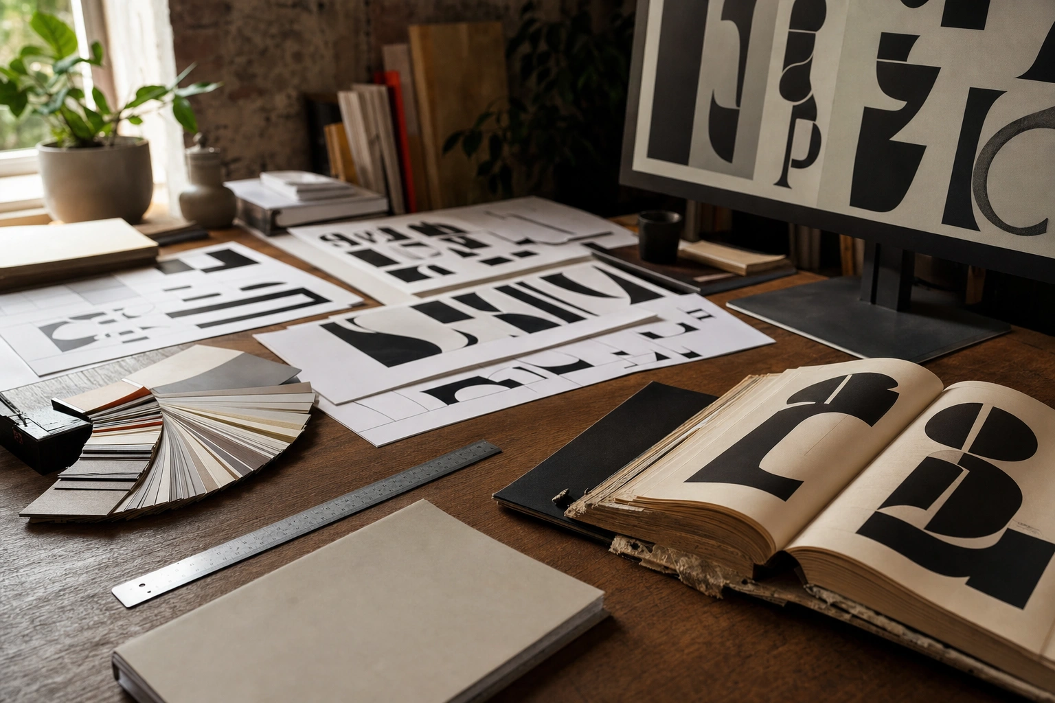
Every visual message has a voice, and typography is one of the main ways that voice is heard. The choice of typeface, the size of the text, the space around it and the way words are arranged can make a message feel authoritative, welcoming, urgent, modern, traditional or confusing before the audience has read every word.
For graphic designers, entrepreneurs, marketers and anyone who prepares presentations or digital content, typography is therefore more than decoration. It is a communication system. Effective typographic decisions help people find information, understand meaning, remember a message and decide what to do next.
What Typography Means in Visual Communication
Typography is the planned arrangement and styling of written language. It includes the selection of typefaces and fonts, but it also covers scale, weight, line spacing, letter spacing, alignment, colour, placement and the relationship between text and other visual elements.
Visual communication occurs when ideas are conveyed through images, symbols, layout, colour and text. Typography connects language with visual form. A sentence communicates its literal meaning, while its typographic treatment adds signals about importance, mood and context.
For example, the wording Community Market could appear in a formal serif typeface for an established agricultural organisation, a heavy sans serif for a contemporary retail campaign, or a playful rounded style for a children’s event. The words remain the same, but the perceived identity changes.
Why Typography Matters
It makes information readable
The first responsibility of typography is to make text easy to read. If letters are too small, lines are too long, spacing is too tight or contrast is weak, the audience must work harder to understand the message. This is especially important for body text, instructions, forms, websites and educational materials.
Readability concerns the ease with which a reader can follow a passage. Legibility is closely related, but often refers more specifically to how clearly individual letters and words can be distinguished. A typeface may be attractive in a logo yet unsuitable for several paragraphs of information.
It establishes hierarchy
Not all information has equal importance. Typography shows readers where to begin, what to notice next and which details are supporting information. A strong hierarchy may use different sizes, weights, colours and spacing for a title, section heading, introductory text, body copy, caption and button.
Consider a public health poster. The main instruction needs to be immediately visible. Supporting explanation can be smaller, while contact details may be separated in a clear information block. Without hierarchy, all the words compete for attention and the reader may miss the central message.
It communicates personality and emotion
Typography influences tone in much the same way that voice influences spoken communication. A narrow, formal serif may suggest heritage or authority. A clean sans serif may feel direct and contemporary. A handwritten style may imply informality or personal expression, although it can become difficult to read if used excessively.
These associations are not fixed rules. Their effect depends on context, culture, surrounding imagery, wording and audience expectations. A typeface that feels traditional in one setting may feel old-fashioned in another. Designers should test their choices rather than relying only on personal preference.
It builds trust and identity
Consistent typography helps an organisation appear deliberate and dependable. When a business uses the same typographic system across its website, invoices, packaging and social media, audiences begin to recognise the identity. Consistency does not mean that every design must look identical; it means that the underlying choices are coherent.
A small enterprise in Kenya, for example, might use a consistent heading style, body-text style and colour system across its menu, delivery cards and online shop. This can make the business feel more organised, even when the materials are produced on different platforms.
Key Elements of Typographic Design
Typeface and font selection
A typeface is the overall design of a family of letters, while a font traditionally refers to a particular size, weight or style within that family. In everyday digital design, the terms are often used interchangeably, but understanding the distinction is useful.
Common categories include serif, sans serif, script, display and monospaced typefaces. Serif typefaces have small finishing strokes and are often associated with editorial or formal communication. Sans serif typefaces lack these strokes and are frequently used for interfaces, signage and contemporary branding. Script and decorative typefaces can create strong character but should normally be reserved for short text.
Choose a typeface according to the communication task. A financial report needs clarity and sustained reading. A music festival poster may allow more expressive lettering. A wayfinding sign requires fast recognition from a distance. The best choice is not simply the most fashionable one; it is the one that supports the message and the conditions in which it will be viewed.
Size and scale
Type size creates emphasis and helps organise content. A large heading attracts attention, while smaller supporting text signals a lower level of priority. However, size should work with spacing and weight. Increasing every heading dramatically can make a page feel noisy rather than structured.
Designers should also consider viewing distance and medium. Text designed for a printed A4 leaflet may not work on a mobile screen or a roadside sign. Check designs at the size and distance at which the audience will actually encounter them.
Weight and style
Weight describes the thickness of letter strokes, such as light, regular, medium, semibold or bold. Heavier weights attract attention and can strengthen headings, but large amounts of bold text reduce contrast between important and less important information.
Italic styles can indicate emphasis, titles or a secondary voice. Underlining is usually best reserved for links or specific conventions, because it can interfere with the shapes of letters. All-capital text may be effective for a short label, but long passages in capitals are generally slower to read.
Line spacing and line length
Line spacing, also called leading, is the vertical distance between lines. Tight spacing can make a paragraph look dense, while excessive spacing can separate lines so much that the reader loses the flow. The appropriate amount depends on the typeface, size, line length and medium.
Line length also affects comfort. Very long lines force the eye to travel widely, while very short lines create frequent interruptions. A balanced text column usually supports a smoother reading rhythm. On websites, responsive layouts should preserve comfortable text widths rather than allowing paragraphs to stretch across the entire screen.
Letter spacing and kerning
Letter spacing, or tracking, adjusts the overall space between characters. Kerning makes more specific adjustments between individual pairs of letters so that combinations appear visually balanced. These details are especially important in headlines, logos and large display text.
Spacing should be judged by appearance, not only by numerical settings. Letters with different shapes create different amounts of visual space. A designer may need to adjust a heading manually even when the general spacing settings seem correct.
Alignment and composition
Alignment gives text a visual structure. Left alignment is often easy to scan in languages read from left to right because each line begins at a consistent position. Centred text can suit short invitations or formal announcements, but long centred paragraphs are usually harder to follow. Right alignment and justified text can be useful in specific layouts, provided readability remains strong.
Typography also depends on its relationship with images, shapes and empty space. Empty space is not wasted space; it separates groups, reduces visual pressure and gives important information room to stand out.
Typography and Visual Hierarchy
A useful typographic hierarchy often has three or four levels. The first level may be a primary heading, the second a section heading, the third body text and the fourth captions or notes. These levels can be distinguished through a combination of size, weight, spacing and colour rather than by changing typefaces at every opportunity.
One practical method is to establish a scale before designing. Decide the size and style of the main heading, then choose supporting sizes that have a clear but controlled relationship with it. The exact values depend on the medium, but the principle is consistent: related information should look related, and different levels should be recognisably different.
Hierarchy should also reflect the reader’s task. In an online service form, the next action may need more visual prominence than the organisation’s slogan. In a report, section headings may matter more than decorative introductory text. Design begins by asking what the audience needs to notice and do.
Typography, Colour and Contrast
Colour can reinforce typographic hierarchy, but it should not carry meaning alone. Text must remain distinguishable from its background, particularly for readers with low vision or colour-vision differences. Light grey text on a white background may appear elegant in a mock-up but become difficult to read on an ordinary screen or in bright outdoor light.
Contrast includes more than colour. Differences in size, weight, spacing and placement also help separate information. A restrained palette with clear structural differences can be more effective than many colours competing for attention.
Designers should test text in realistic conditions: on smaller phones, printed copies, projected screens and low-quality displays where relevant. If important information disappears under ordinary conditions, the design is not communicating reliably.
Cultural and Linguistic Considerations
Typography is shaped by language and culture. Letterforms, reading direction, punctuation, diacritics and local visual traditions can affect how a design should be developed. A typeface that supports English may not provide suitable characters for Kiswahili or other languages used by an audience. Language support should be checked before a typeface is adopted.
Words can also carry cultural associations. A style that appears formal, youthful or luxurious in one community may be interpreted differently elsewhere. Designers working on campaigns across African markets should avoid assuming that a single typographic treatment will have exactly the same effect in every country or language group.
Authentic communication requires more than adding decorative cultural references. It involves understanding the audience, checking translations, allowing enough room for text expansion and testing the design with people who know the language and context.
Common Typography Mistakes
- Using too many typefaces: Several unrelated typefaces can make a layout feel disorganised. A small, compatible type system is usually easier to control.
- Choosing style over function: Decorative lettering may look impressive but fail when used for instructions, long paragraphs or small screens.
- Ignoring spacing: Even a well-chosen typeface can look amateurish when lines, letters and sections are crowded together.
- Weak contrast: Attractive colour combinations are not useful if readers cannot distinguish the words.
- Inconsistent formatting: Random changes in heading sizes, alignment and emphasis make it harder to understand the structure.
- Neglecting proofreading: A typographically polished design still fails if words are misspelled, punctuation is inconsistent or line breaks create unintended meanings.
A Practical Typography Workflow
- Identify the audience and purpose. Decide who will read the message, what they already know and what you want them to understand or do.
- List the information levels. Separate the title, key message, supporting explanation, instructions, details and action point.
- Select a suitable type system. Choose typefaces that support the language, medium, tone and reading conditions. Limit the number of families and define useful weights.
- Create an initial hierarchy. Set styles for headings, body text, captions and labels before filling the layout with content.
- Arrange and space the content. Adjust line length, leading, margins, alignment and the space between related sections.
- Check readability and accessibility. Test contrast, text size, zoom behaviour and the design’s performance on likely devices or printed materials.
- Review in context. Ask whether the intended message is noticed first and whether the reader can move through the information without confusion.
- Revise based on evidence. Use feedback from actual users or colleagues who represent the audience. Change elements that cause hesitation, not only those that seem visually imperfect.
Applying This in Practice
Suppose an entrepreneur is creating a poster for a weekend farmers’ market. The first step is to identify the most important information: the event name, date, location and reason to attend. The event name can receive the strongest typographic emphasis, while the date and location should remain immediately visible. Vendor details and contact information can be smaller but still readable.
A friendly, highly decorative typeface might suit a short event name, but it should be paired with a clearer typeface for practical details. Strong contrast between text and background will help the poster work in daylight and on social media. Adequate spacing will prevent the design from feeling crowded, especially if the wording must be read quickly.
The same principles apply to a presentation, CV, business proposal, website or classroom handout. Start with the reader’s needs, establish order, select type with a purpose and test the result in its real environment. Typography becomes effective when it reduces effort while strengthening meaning.
Key Takeaways
- Typography communicates tone, identity and importance as well as literal words.
- Use size, weight, spacing, alignment and contrast to create a clear hierarchy.
- Choose typefaces for the audience, language, medium and reading conditions, not personal taste alone.
- Keep body text readable and reserve decorative styles for suitable short-form uses.
- Test designs on realistic screens, printed materials and viewing distances.
- Review typography in context and revise any element that makes the audience hesitate or lose information.
No comments yet.