
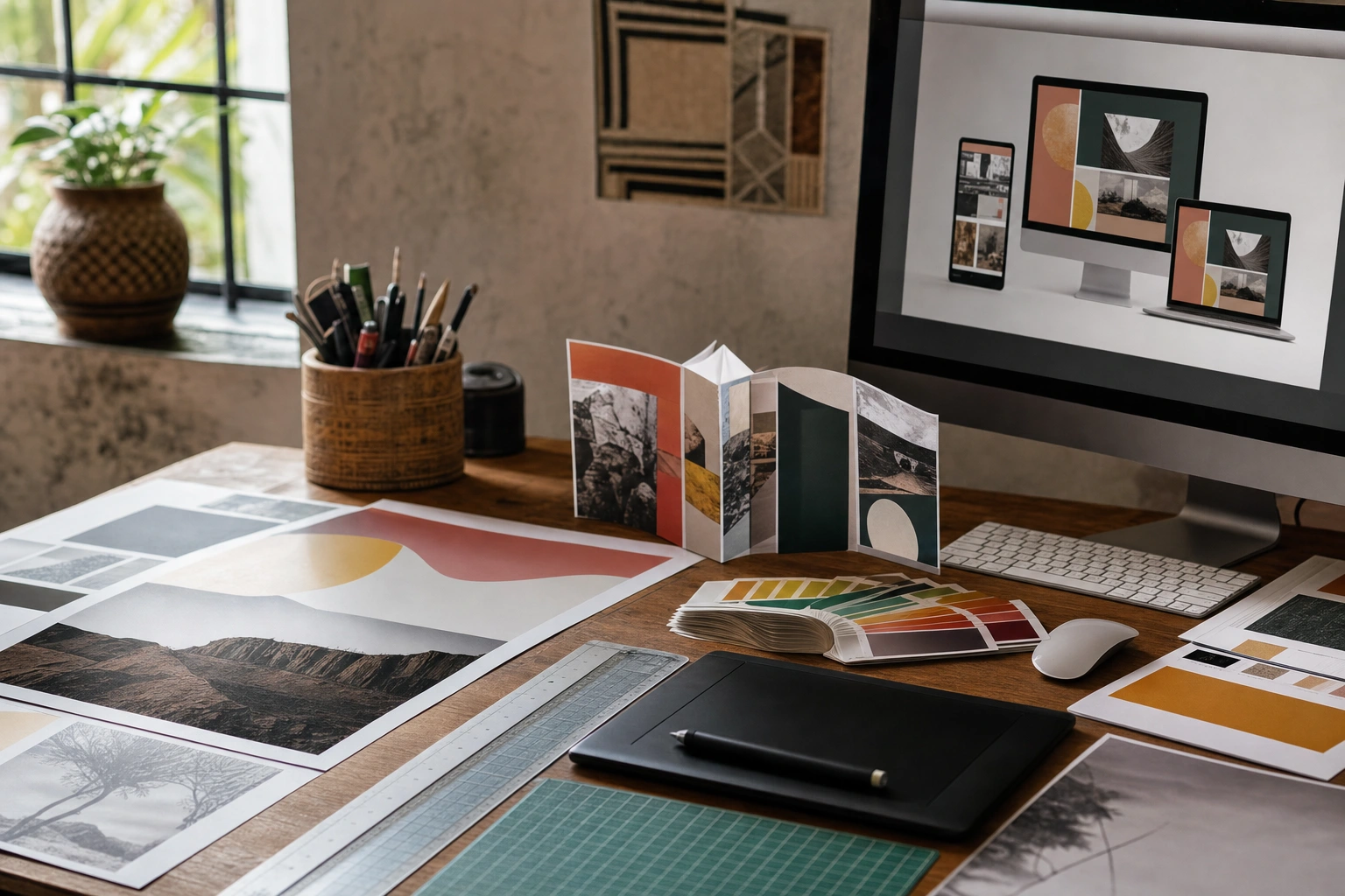
Graphic design rarely lives in one format. A campaign may begin as a poster, continue as an Instagram post, appear in a newspaper advert and end as a brochure or presentation slide. Although these materials may share a visual identity, they do not share the same technical conditions. A design that looks excellent on a screen can print poorly, while a beautifully printed layout may be difficult to read on a mobile phone.
Designing for print and digital media means understanding how people encounter information, how different technologies reproduce colour and images, and how a layout must change across physical and digital environments. The goal is not simply to resize one file repeatedly. It is to preserve the message and visual character of a design while making deliberate adjustments for each medium.
Understanding the Difference Between Print and Digital Design
Print design is created for a physical surface such as paper, card, fabric, packaging or signage. The final product is usually fixed in size and viewed under changing lighting conditions. Digital design is displayed through a screen, where dimensions, brightness, interaction and viewing distance can vary considerably.
These differences affect nearly every design decision:
- Print has a physical size. An A4 leaflet, a roadside banner and a business card each have a defined area. Digital designs may appear on screens ranging from a smartwatch to a large monitor.
- Print is generally static. Digital media may include animation, video, buttons, scrolling, audio or other interactive features.
- Print uses physical ink or toner. Digital media uses light emitted by a screen. This changes how colour and contrast are perceived.
- Print is often viewed from different distances. A poster must be readable from several metres away, while a phone graphic may be viewed at arm’s length.
- Digital content may be updated. A printed brochure cannot be corrected after distribution without producing another print run, but a website or online advert can often be revised.
A strong designer begins by asking where, how and by whom the design will be used. The same message may require different hierarchy, cropping, dimensions and file preparation for each channel.
Start with Purpose, Audience and Context
Before opening design software, clarify the communication problem. A design for a community health notice, a technology start-up, a professional training course or a retail promotion will not use the same tone, imagery or information structure.
Define the communication goal
Decide whether the design must inform, persuade, instruct, identify, reassure or prompt an action. A poster might need to make a date and location immediately visible. A product page may need to explain benefits before leading the visitor towards a purchase. A business card may prioritise recognition and contact details rather than extensive information.
Study the audience and viewing situation
Consider the audience’s language, reading ability, visual expectations, device access and likely viewing conditions. A digital notice designed for mobile phones should not depend on tiny text or hover effects that are unavailable on touchscreens. A printed sign placed outdoors needs strong contrast, durable materials and typography that remains legible in bright daylight.
List the required outputs
Prepare a simple production list before designing. It might include an A3 poster, an A5 flyer, a website banner, a square social media post and a presentation slide. Record the dimensions, orientation, colour requirements, text, images, deadlines and delivery formats for each item. This reduces last-minute alterations and helps establish a flexible visual system from the beginning.
Build a Flexible Visual System
Consistency does not mean that every version must look identical. It means that the audience should recognise the relationship between the versions. A flexible system normally includes a logo treatment, colour palette, type choices, image style, graphic shapes, spacing rules and a clear information hierarchy.
For example, a Kenyan social enterprise promoting solar lighting might use a consistent name, warm colour palette and photographic style across a printed brochure and online campaign. However, the brochure could include detailed specifications and a map, while the mobile post might feature one benefit, a short message and a clear next step.
Create the core elements before producing every variation. Establish primary and secondary typefaces, heading levels, body text styles, button or call-to-action treatments, and rules for placing logos. Use templates or components where possible, but allow enough flexibility for different content lengths and screen sizes.
Colour: CMYK, RGB and Real-World Appearance
Colour is one of the most important differences between print and digital media. Screens create colour using light, commonly through RGB channels: red, green and blue. Printing typically combines inks or toners using a CMYK process: cyan, magenta, yellow and black. The exact result depends on the printer, paper, ink, calibration and viewing conditions.
Bright screen colours may not reproduce as brightly on paper. A vivid green or electric blue selected for a website may appear duller in a printed leaflet. Very dark areas can also lose detail if several ink channels are heavily combined. For this reason, print artwork should be prepared according to the printer’s specifications rather than relying only on how it appears on a monitor.
Practical colour checks
- Confirm whether the printer requests CMYK, a particular colour profile or another specification.
- Ask whether spot colours are needed for brand accuracy or special production effects.
- Request a proof when colour consistency is important, especially for packaging, signage or a large print run.
- Do not use colour alone to communicate meaning. Combine colour with labels, icons, patterns or clear text so that information remains understandable to people with colour-vision differences.
- Check digital designs on more than one screen, because brightness and colour settings vary between devices.
For digital work, RGB images are generally appropriate, but the final requirements still depend on the platform and workflow. A website may use modern compressed image formats, while a social media platform may resize and recompress uploaded files.
Resolution, Dimensions and Image Quality
Print images are commonly prepared using a resolution expressed in pixels per inch, often abbreviated as PPI. A small image enlarged excessively may appear soft or pixelated. A photograph that looks sharp on a phone may not contain enough detail for a large poster or banner.
Digital images are judged mainly by their pixel dimensions and how they are displayed. A design intended for a high-density phone screen may require more pixels than its visible CSS or layout size suggests. The platform may also crop the image or display it differently in a feed, search result or preview.
Choose images based on the largest realistic use, while avoiding unnecessary file sizes. For print, obtain the highest-quality original available and check it at the intended physical size. For digital, export a version that is sharp enough for the target display but not so large that it slows loading or becomes difficult to share.
Do not confuse resolution with quality. A technically large image can still be poorly focused, badly lit or unsuitable for the message. Image quality includes subject relevance, composition, licensing, colour, sharpness and ethical use.
Layout, Scale and Information Hierarchy
Print and digital designs both need hierarchy: the viewer should know what to notice first, what to read next and what action to take. Hierarchy can be created through scale, position, weight, contrast, spacing, alignment and colour.
In print, the fixed page allows the designer to control the entire composition. A brochure may use columns, page numbers, captions and deliberate page turns. In digital media, the layout may be interrupted by scrolling, navigation elements, notifications or different screen widths. Important information should therefore appear early and remain easy to locate.
Design for scale rather than simple resizing
A landscape poster cannot always become a square social post by cropping its edges. The main subject may disappear, the headline may wrap awkwardly or the reading order may become unclear. Instead, create an adaptation. Reposition the image, shorten the text, adjust the hierarchy and select a layout that suits the new shape.
For responsive digital design, consider a range of screen widths. A three-column desktop layout may become two columns on a tablet and one column on a phone. Images may crop differently, navigation may collapse and buttons may need more space for touch interaction. Test realistic content, not only placeholder text.
Typography for Paper and Screens
Typography must remain readable, appropriate and consistent in both environments. A typeface that looks elegant in a large printed headline may be difficult to read at small sizes on a low-quality screen. Conversely, a highly functional screen typeface may not provide the character required for a formal invitation or premium printed publication.
Use a clear distinction between headings, subheadings, body copy, captions and supporting information. Avoid using too many typefaces or decorative styles. Pay attention to line length, line spacing, letter spacing and contrast between text and its background.
For print, check the actual paper size and reading distance. A brochure with dense paragraphs may need generous margins and shorter sections. For digital media, test text at mobile size and consider accessibility. Text embedded inside an image may be difficult to enlarge, search or interpret with assistive technology, so essential information should also exist as live text where the platform allows it.
Always check font licensing and whether the selected fonts can be embedded or shared with printers and collaborators. If a file is sent to a printer without the required fonts, the layout may change. Packaging or outlining fonts can solve some production problems, but it can also make later editing more difficult, so retain an editable master file.
Bleed, Margins and Safe Areas in Print
Printed sheets are usually trimmed after printing. Because cutting cannot be perfectly exact, important text and logos should not sit too close to the edge. A margin is the internal space around the content. A safe area is the region where critical information should remain. Bleed extends backgrounds, colours or images beyond the final trim edge so that small cutting variations do not create unwanted white lines.
The amount of bleed depends on the printer and production method, so confirm it before setting up the document. Include crop marks only when requested. A printer may also need separate requirements for folds, perforations, binding, die-cutting or large-format materials.
For example, a folded menu requires more than a single flat rectangle. The designer must account for panel order, fold positions, safe areas and the way content will be viewed when the menu is opened. A print-ready file should be checked as a finished object, not only as a collection of individual panels.
Digital Accessibility and Interaction
Digital design should support as many users as reasonably possible. Accessibility includes sufficient contrast, readable text, meaningful headings, descriptive alternative text for important images and controls that are understandable without relying on colour alone.
Interactive elements should look and behave like actions. A button should be visually distinct from ordinary text, large enough to select comfortably and labelled with a clear instruction. Do not hide essential information behind hover states, since hover may not exist on a mobile device. If animation is used, keep it purposeful and avoid movement that distracts from reading or creates discomfort.
Accessibility also improves general usability. Clear hierarchy helps a busy professional scan a page quickly. Captions help people understand video in noisy environments. Descriptive links are more useful than vague labels such as click here. These choices make a design more effective, not merely more compliant with a checklist.
File Formats and Production Handover
The correct file format depends on the purpose and the next person in the workflow. Editable source files are useful for future changes. Print-ready PDFs are commonly used for sharing completed layouts with printers, provided they meet the printer’s requirements. SVG is useful for many scalable digital graphics, while PNG can preserve transparency and JPEG can be suitable for photographic images. The best choice depends on image content, quality needs and platform support.
Use sensible file names and maintain versions. A handover folder might contain the final print PDF, digital exports, linked images, licensed fonts where permitted, colour references and a short specification sheet. Do not overwrite the editable master with flattened or compressed exports.
Before delivery, check spelling, contact details, dates, prices, alignment, image permissions, colour mode, dimensions, bleed, links and accessibility. Review the final exported file rather than assuming it matches the working document. For digital work, test the design on the actual website, email template or publishing platform when possible.
Applying This in Practice
Imagine that a small Nairobi-based training business is launching a short course. It needs an A4 poster for partner offices, an A5 handout, a website header, a square social media graphic and a mobile-friendly registration page.
- Clarify the message. Identify the course name, audience, date, location or delivery method, price if relevant, and registration action.
- Prioritise information. Make the course benefit and registration instruction prominent. Move detailed topics and supporting information into the handout or web page.
- Create the visual system. Select the logo treatment, type styles, colour palette and image approach before adapting the materials.
- Design the master layout. Start with the format that contains the most important information, while keeping the composition modular enough to adapt.
- Adapt deliberately. Rebuild the square graphic and mobile layout rather than stretching the poster. Shorten copy where necessary and preserve the main hierarchy.
- Prepare production files. Add bleed and safe margins to print artwork, export suitable digital images, and keep text live on the registration page.
- Test and review. Print a proof at the intended size, check the design on a phone, verify every detail and ask someone unfamiliar with the project what they notice first.
This process separates communication decisions from software operations. Software can resize, export and apply effects, but it cannot decide which information matters most, whether a photograph is appropriate or whether a viewer will understand the next step.
Key Takeaways
- Design for the physical or digital context instead of resizing one layout for every channel.
- Establish purpose, audience, viewing conditions and required outputs before designing.
- Use CMYK and printer specifications for print, while preparing digital work for screens and platform requirements.
- Check dimensions, image quality, bleed, margins and safe areas before sending print artwork.
- Build hierarchy through scale, spacing, contrast and typography so viewers know what to read or do first.
- Adapt layouts deliberately for different screen sizes and keep essential digital information accessible.
- Review the final exported files and test them in the real environment before publication or production.
No comments yet.