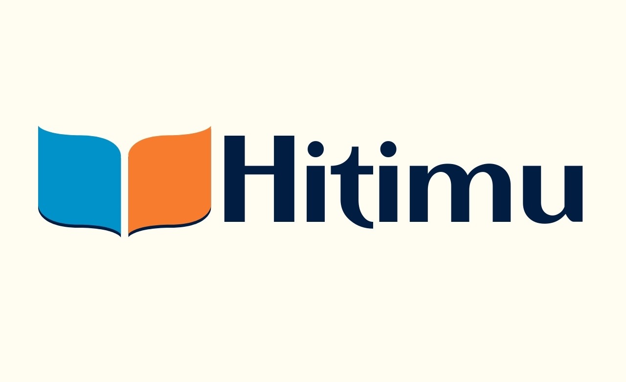

At Hitimu Academy, every detail matters—including our logo. Designed with intention and symbolism, our logo is more than a visual mark. It’s a reflection of who we are, what we believe in, and the journey we walk with every learner. Let’s take a closer look at what the logo truly represents.
1. The Letter “H” – Our Identity, Boldly Stated
At the heart of the logo lies a bold and creative representation of the letter H, the first letter of Hitimu. Rather than using traditional typography, the logo shapes the “H” through two flowing forms—blue on the left and orange on the right. This design choice gives our brand a modern, sleek identity while subtly reinforcing the name Hitimu in every visual impression.
2. The Open Book – A Commitment to Learning
The same curves that form the “H” also resemble the pages of an open book, a powerful global symbol of:
- Knowledge and lifelong learning
- Discovery and empowerment
- Educational progress
This visual metaphor speaks directly to our mission: opening minds, shaping futures, and unlocking each learner’s full potential through quality education.
3. Dual Colors – Wisdom Meets Innovation
Our color palette is purposeful:
- Blue stands for trust, intelligence, and stability. It reflects the academic depth, professionalism, and reliability of Hitimu Academy.
- Orange embodies creativity, energy, and transformation—core traits of our modern, dynamic learning environment.
Together, these colors convey balance: between tradition and innovation, discipline and creativity, content and experience.
4. Curved Symmetry – Growth with Structure
The flowing curves and symmetrical design suggest movement and harmony. These elements mirror the learner’s journey at Hitimu:
- Structured but flexible
- Guided but explorative
- Grounded yet elevating
Just as the pages of a book turn to reveal new chapters, our students grow through guided progression—each step building on the last.
5. Subtle Depth – Anchored in Purpose
Look closer and you’ll notice a slight shadow beneath the curves. This touch of depth adds a grounded feel—reminding us that while we look ahead, we are firmly rooted in purpose, values, and excellence.
Conclusion: A Logo that Tells Our Story
The Hitimu Academy logo is a visual story—of who we are, what we offer, and the journey we invite our learners to take. It’s a stylized “H”, an open book, a balanced blend of intellect and imagination. It is our identity, our purpose, and our promise—captured in color and shape.
As we continue to grow, innovate, and empower, this logo remains a beacon of what Hitimu Academy stands for: education with meaning, design with purpose, and transformation through learning.