
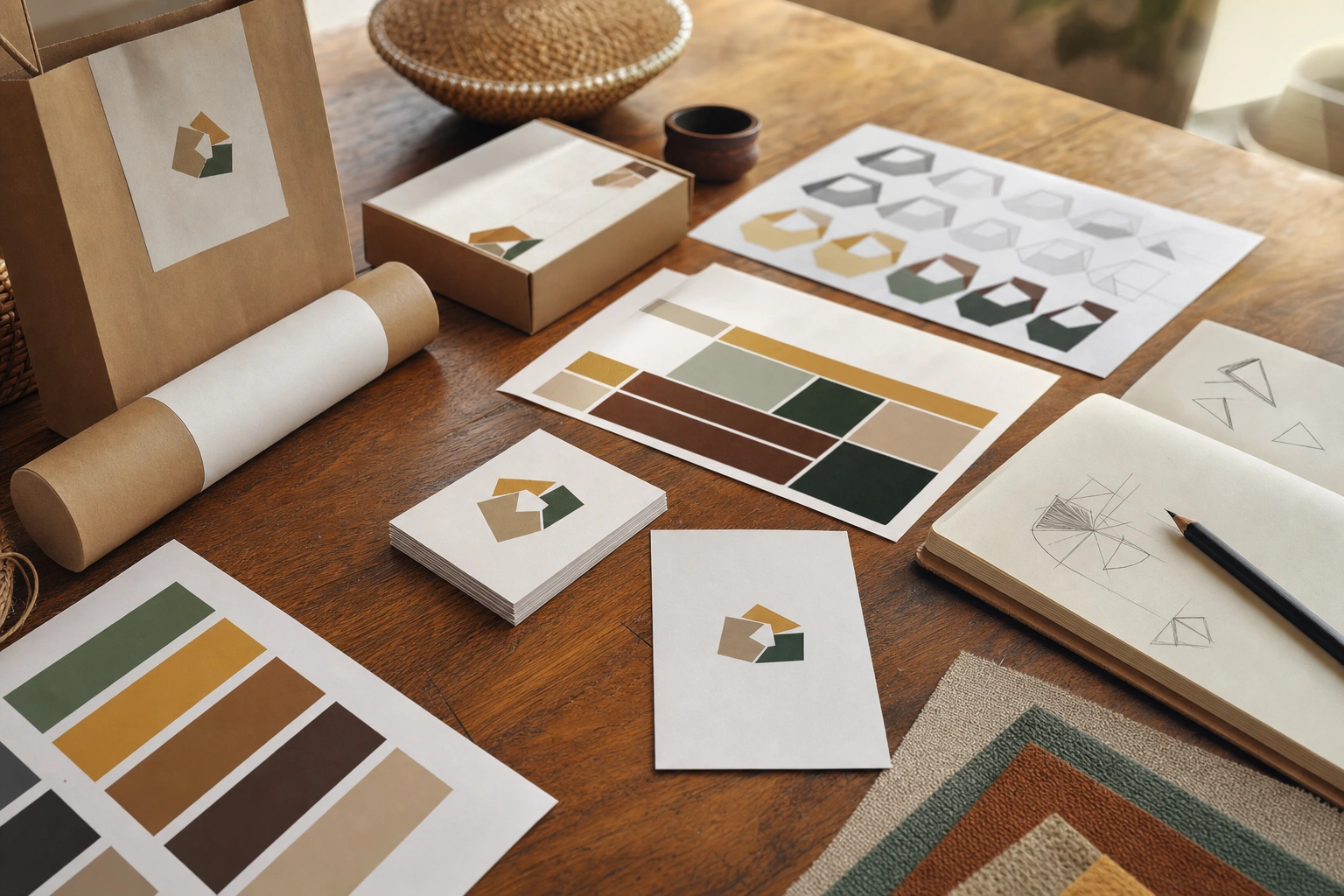
When customers encounter a business for the first time, they may notice its name, colours, packaging, storefront, website or social media content. A logo often brings these elements together in one recognisable visual mark. It can appear on a sign outside a shop in Nairobi, a product label in Kampala, a professional proposal, a mobile application or a company vehicle travelling across a county.
However, a logo is not the brand itself. A brand is the wider set of perceptions and experiences people associate with an organisation, product or service. The logo is one important part of that system. Its role is to help people identify the organisation quickly and connect it with memories formed through repeated interactions. Effective logo design therefore combines visual craft with strategic thinking.
What Is a Logo?
A logo is a distinctive visual identifier used to represent a business, organisation, product, service or initiative. It may consist of lettering, a symbol, a combination of words and symbols, or another designed mark. Some logos rely mainly on the organisation’s name, while others use an image that can stand independently after the audience has become familiar with it.
Common forms include:
- Wordmarks: logos built primarily from the organisation’s name, with typography doing much of the visual work.
- Lettermarks: marks based on initials, often useful when a full name is long or difficult to reproduce in small spaces.
- Symbols or icons: graphic marks that communicate through shape and visual association rather than written words alone.
- Combination marks: a symbol and a wordmark used together, sometimes with the flexibility to separate them in certain applications.
- Emblems: lettering placed within a contained shape, such as a badge, seal or crest.
These categories are not strict rules. A growing organisation may use several versions of its logo while maintaining a coherent identity. What matters is whether the chosen design supports recognition, clarity and consistent use.
Logo, Brand and Visual Identity: The Difference
These terms are often used interchangeably, but they describe different things. A logo is a visual identifier. A visual identity is the broader collection of visual elements used by a brand, including colour palettes, typography, photography style, illustration, layouts, packaging and motion graphics. A brand includes the audience’s overall perception, shaped by products, service quality, communication, reputation and experience.
For example, a Kenyan coffee company may have a carefully designed logo featuring a simple coffee-related symbol. Its visual identity may also include earthy colours, particular typefaces, patterned packaging and a consistent photographic style showing farms and preparation methods. The brand, however, is influenced by whether customers trust the company, enjoy the coffee, receive orders reliably and understand what makes the product different.
This distinction matters because a beautiful logo cannot compensate for poor service or an unclear offer. At the same time, a strong business can struggle to be remembered if its visual identity is inconsistent or difficult to recognise. Logo design is therefore one part of a larger brand-building process.
How Logos Support Brand Recognition
They create a visual shortcut
People often make decisions in environments filled with information. A logo gives the audience a compact visual cue that can be recognised more quickly than a full explanation of the organisation. On a crowded marketplace, a familiar mark may help a customer locate a preferred product among many similar options.
This shortcut becomes useful through repeated exposure. A person may first notice a logo without remembering it. Later, after seeing it on a website, receipt, product or social media post, the mark begins to feel familiar. Recognition develops when the visual identity is repeatedly connected with the same organisation and experience.
They help distinguish similar offers
Many businesses operate in competitive categories where products and services appear similar. Restaurants, salons, financial services, clothing labels, training providers and technology companies may all need to communicate trust and relevance to the same audience. A distinctive logo helps separate one offer from another.
Distinctiveness does not always require complexity. A simple, well-proportioned mark may be more memorable and more useful than an elaborate illustration with many small details. The goal is not to make a logo look unusual at any cost, but to give the brand a clear visual identity that is not easily confused with competitors.
They signal consistency
Consistency helps audiences understand that different touchpoints belong to the same organisation. A logo used appropriately on a website, invoice, social media profile, packaging and physical premises creates continuity. This is particularly valuable for small businesses that may communicate through many informal channels.
For instance, a tailoring business might use its logo on fabric labels, delivery packaging, WhatsApp business materials and a roadside sign. If the mark remains recognisable across these settings, customers are more likely to connect each interaction with the same business.
They carry accumulated associations
A logo does not automatically communicate every quality a business wants to claim. Its meaning develops through association. If an organisation repeatedly delivers reliable service, communicates clearly and maintains a consistent experience, the logo can become linked with those qualities. If customers encounter delays, poor workmanship or misleading communication, the same mark may become associated with disappointment.
This is why brand recognition and brand reputation are connected but not identical. Recognition means that people can identify the organisation. Reputation concerns what they believe and feel about it. A logo makes recognition easier, but the organisation’s behaviour gives that recognition meaning.
What Makes a Logo Effective?
Distinctiveness
An effective logo has features that help it stand apart. Distinctiveness may come from a memorable shape, a carefully drawn letterform, an unusual but appropriate colour relationship or a visual idea connected to the organisation’s position. Designers should research the category before creating concepts, because a mark that looks attractive in isolation may appear generic beside competitors.
Relevance
The logo should fit the organisation, its audience and its intended position. A playful, hand-drawn style may suit a children’s creative workshop but feel inappropriate for a formal legal practice. Conversely, a highly conservative emblem may not express the energy of a youth-focused technology project.
Relevance does not mean illustrating the product literally. A construction company does not necessarily need a building icon, and a school does not necessarily need an open-book symbol. Designers can communicate values such as reliability, growth, precision or community through form, proportion and typography without relying on predictable images.
Simplicity
Simplicity improves recognition and reproduction. A simple mark is easier to notice at a distance, remember after a brief encounter and reproduce across different materials. It is also more likely to remain clear when reduced to a small profile image or printed on a pen.
Simplicity should not be confused with a lack of thought. Removing unnecessary detail often requires more design judgement than adding decoration. Every shape, line and colour should have a reason to exist.
Legibility and scalability
A logo should remain understandable at the sizes and distances where it will be used. A detailed logo may look impressive on a large presentation slide but lose its essential features on a mobile screen, product seal or embroidered uniform. Designers should test the mark in large and small formats, in colour and in one colour, and on both light and dark backgrounds.
Appropriate colour and typography
Colour can support recognition, create contrast and influence the character of an identity. Yet colour meaning is shaped by context and culture, so designers should avoid treating colour psychology as a fixed formula. More importantly, a logo should remain identifiable when colour is unavailable, such as in a monochrome document or low-cost print application.
Typography also affects the personality and clarity of a wordmark. Letter spacing, weight, shape and proportion can make a name feel formal, friendly, technical or contemporary. Customising or carefully selecting type can help a logo look distinctive, but legibility must remain a priority.
Logo Design as Part of a Brand System
A logo works best when it is supported by a practical identity system. This system may include a primary logo, a simplified small-size version, an icon, colour specifications, typefaces, spacing rules and examples of correct and incorrect use. These guidelines are especially important when several employees, suppliers or agencies produce communication materials.
A brand guideline might specify the clear space that should surround the mark, minimum display size, approved background colours and rules against stretching, rotating or adding unapproved effects. It may also explain how the logo should appear on uniforms, packaging, websites, signage and documents.
The purpose of guidelines is not to prevent useful adaptation. It is to protect the features that make the mark recognisable. A business may need a horizontal version for a website header, a stacked version for a poster and a single-colour version for a stamp. These variations should feel related rather than appearing to be unrelated logos.
Common Logo Design Mistakes
Designing for personal taste alone
The owner’s preference matters, but a logo must serve the organisation and its audience. A design that one person likes may not be legible, relevant or distinctive in the real market. Decisions should be tested against the brand’s purpose, audience, competitors and practical applications.
Using excessive detail
Small details often disappear when a logo is reduced or reproduced using inexpensive printing. Dense illustrations can also make the mark difficult to recognise quickly. If an image requires a long explanation before viewers understand it, the concept may need refinement.
Copying familiar trends
Trendy gradients, generic icons and fashionable typefaces may make a logo look current for a short period, but they can also make it resemble many other brands. A design should respond to the organisation’s character rather than simply imitate popular examples.
Relying on colour to do all the work
If a logo is recognisable only in one particular colour combination, its usefulness becomes limited. It should also work in black and white or in a restricted colour environment. This is important for photocopied forms, stamps, invoices, embroidery and certain digital applications.
Ignoring cultural and linguistic context
Symbols, gestures, colours and words can carry different meanings across communities. A logo intended for a Kenyan, regional or international audience should be reviewed for unintended associations, pronunciation difficulties and visual interpretations. This does not mean avoiding cultural meaning; it means using it thoughtfully and testing assumptions.
A Practical Logo Development Process
- Clarify the brand foundation. Define what the organisation offers, whom it serves, what makes it different and how it wants to be perceived.
- Study the context. Review competitors and related organisations to identify common visual patterns and opportunities for distinction.
- Choose a suitable direction. Decide whether a wordmark, symbol, combination mark or another structure best fits the name, audience and applications.
- Develop and refine concepts. Explore several ideas, then improve the strongest options for shape, spacing, balance, legibility and relevance.
- Test real applications. Place the logo on the actual materials it may use, such as a mobile profile, storefront, packaging, invoice, uniform or vehicle.
- Prepare usable files. Provide appropriate formats for print and digital use, including versions that work at different sizes and on different backgrounds.
- Create simple usage guidance. Explain how the mark should be used and identify the adaptations that are approved.
Testing should involve more than asking whether people like the design. Ask what they notice first, whether they can read the name, what kind of organisation they expect it to represent and whether they can distinguish it from competing marks. Feedback should inform refinement, but it should not turn the design into a collection of unrelated personal preferences.
Applying This in Practice
If you are developing a logo for a small enterprise, begin with the places where customers actually encounter the business. A food vendor may need a clear mark for a menu board, delivery sticker, social media account and reusable packaging. A consultant may need a professional wordmark for proposals, invoices, presentations and a website. A community organisation may require a version that remains clear when printed in one colour.
Create a short evaluation checklist:
- Can the name or symbol be understood quickly?
- Does the design look different from nearby competitors?
- Does it suit the organisation’s audience and personality?
- Does it remain clear when made very small?
- Does it work without relying on colour?
- Can it be reproduced affordably across the organisation’s main materials?
- Can different people use it consistently with simple guidance?
After launch, assess recognition over time rather than expecting the logo to work instantly. Use it consistently and connect it with dependable products, services and communication. If the organisation grows or changes direction, review the identity carefully. A refresh may improve legibility or modernise the system, while a complete redesign may be appropriate when the existing mark is confusing, outdated or no longer aligned with the organisation.
Key Takeaways
- A logo is a visual identifier, while the brand includes the wider experience and reputation associated with an organisation.
- Repeated, consistent use helps a logo become a visual shortcut for recognition.
- Distinctiveness, relevance, simplicity, legibility and scalability are central qualities of an effective logo.
- Colour and typography should support recognition but should not carry the entire identity on their own.
- Logo decisions should be tested on real materials and in real sizes, not only viewed on a design screen.
- Brand guidelines help employees and suppliers protect consistency across different applications.
No comments yet.