
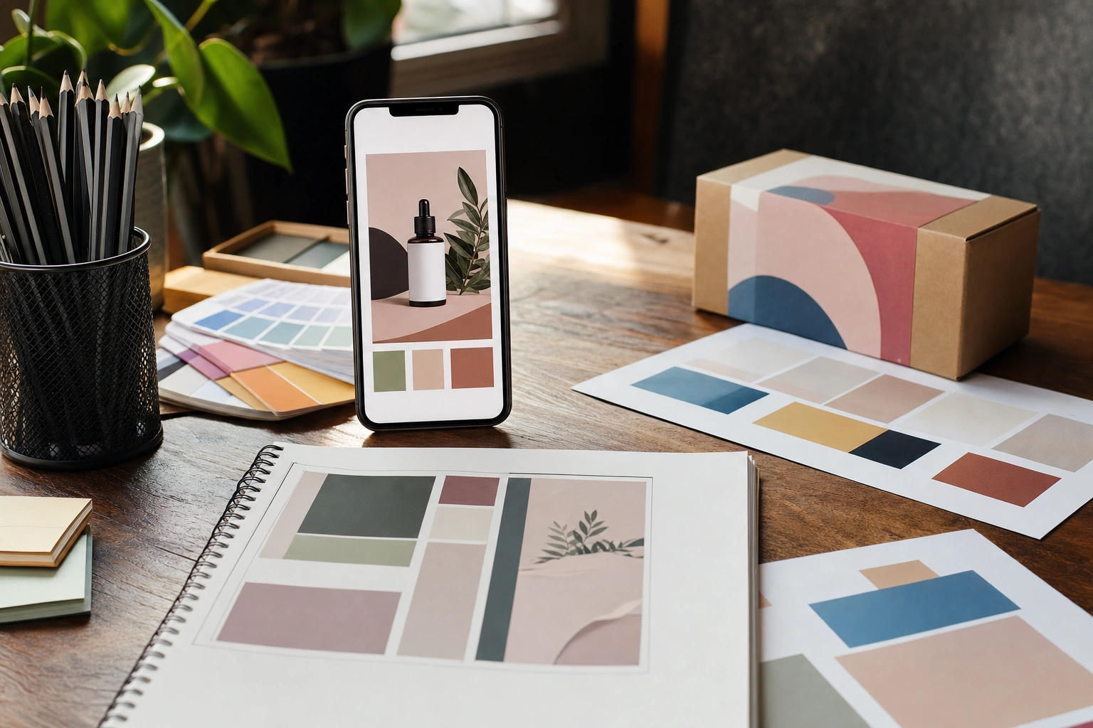
On social media, people often encounter a business through a single image before they read a caption, visit a website or speak to a salesperson. That image must communicate quickly: what is being offered, who it is for, why it matters and what the viewer should do next. Promotional graphics perform this communication role through visual choices rather than words alone.
Effective social media design is therefore not simply about making a post attractive. It is about making value visible and understandable. A well-designed graphic can help a customer recognise a useful solution, distinguish a serious offer from background noise and feel confident enough to take the next step. A poorly designed graphic may hide the main benefit, create uncertainty or make even a good product appear unprofessional.
What Promotional Graphics Communicate
A promotional graphic is a visual message created to support a marketing objective. It may advertise a product, announce a service, promote an event, share an offer or encourage an action such as booking, subscribing or visiting a shop. On platforms such as Instagram, Facebook, LinkedIn, TikTok and WhatsApp, the graphic works alongside other elements, including the caption, profile, comments and landing page.
The graphic usually communicates several layers of information at once:
- Identity: who is making the offer and what kind of organisation or professional it is.
- Offer: what product, service, event or opportunity is available.
- Benefit: how the audience may gain from responding.
- Relevance: why the message may matter to a particular group of people.
- Urgency or timing: whether the offer is available for a limited period or linked to a specific date.
- Action: what the viewer should do next.
These messages do not need to be presented as a long explanation. Good design organises them so that the audience can interpret the most important information quickly and continue exploring if interested.
Value Is More Than a Low Price
One of the most important principles in promotional design is that value is not the same as price. Price tells people what they must pay. Value explains why the exchange may be worthwhile.
For example, a Kenyan catering business might promote a corporate lunch package. A graphic that says “Lunch from KSh 850” communicates cost, but not necessarily value. A stronger message might make the benefit clearer: “Reliable office lunches for busy teams”, supported by a photograph of well-presented meals and a simple note about delivery or menu options. The price can still appear, but it is no longer carrying the entire message.
Value may come from different qualities, including:
- saving time or reducing effort;
- improving comfort, convenience or reliability;
- solving a specific problem;
- helping the customer achieve a practical or emotional goal;
- providing expertise, quality or personal attention;
- reducing uncertainty through clear information and evidence.
Design communicates these qualities by selecting appropriate words, images, colours, spacing and visual emphasis. A premium service may require a calm, refined visual language, while a limited-time market offer may benefit from stronger contrast and more immediate wording. The key question is not “Does this look attractive?” but “What does this design lead the audience to believe about the offer?”
How Visual Hierarchy Directs Attention
Visual hierarchy is the arrangement of elements according to their importance. It determines what the viewer notices first, second and third. Without hierarchy, every word, image and decorative feature competes for attention, making the message difficult to understand.
A useful promotional graphic often has a clear sequence:
- Primary message: the main benefit, offer or announcement.
- Supporting information: details that help the viewer understand the offer.
- Action prompt: the next step, such as “Book today”, “Register online” or “Send a message”.
- Trust or identity cues: the business name, logo, contact details or relevant proof.
Hierarchy can be created through size, position, colour, weight, contrast and empty space. A headline may be larger and placed near the top or in the strongest visual area. Supporting text should be smaller but still readable. The call to action should be noticeable without competing with the main benefit.
Consider a graphic promoting a professional training workshop. If the organiser’s logo is huge, the workshop title is tiny and the registration details are crowded into a corner, the design gives priority to identity rather than usefulness. A better structure might give the workshop outcome the strongest position, place the date and venue where they are easy to scan, and use a distinct but restrained button-like area for registration instructions.
Typography Turns Information into Meaning
Typography is the design of written language. In promotional graphics, it affects both readability and perception. Typeface choice, size, spacing, alignment and line length can make a message feel modern, dependable, energetic, formal or informal.
Use typography to support the character of the offer. A formal financial service may need a clear, stable typeface and disciplined spacing. A children’s creative workshop may allow more expressive lettering, provided that the essential information remains easy to read. Decorative fonts can be useful for a short accent, but they should not carry important details such as dates, prices or contact instructions if they reduce legibility.
A practical type system usually includes no more than a few clear levels:
- a prominent headline;
- a supporting line or short explanation;
- essential details such as time, location or price;
- a clear call to action.
Avoid placing long paragraphs inside a graphic. Social media users often view posts on small screens and may be moving quickly through a feed. The graphic should communicate the central promise, while the caption or linked page provides fuller information.
Colour Communicates Emotion and Priority
Colour can attract attention, group related information and influence how an offer is perceived. However, colour does not have a universal meaning in every context. Cultural associations, personal experience, industry conventions and brand identity all affect interpretation.
Rather than choosing colours only because they look attractive, ask what role each colour plays. A primary brand colour may identify the business. A contrasting colour may highlight the call to action. A neutral background may give the headline room to breathe. A limited palette can make the message feel organised, while too many competing colours can make it appear confused or inexpensive.
Contrast is especially important. Text must stand out clearly from its background, including when viewed outdoors, on a low-brightness phone or by someone with limited vision. A pale grey headline on a white background may look subtle on a designer’s monitor but become unreadable on a mobile screen. Strong contrast, sensible font sizes and generous spacing improve both accessibility and perceived quality.
Colour should also remain consistent across a campaign. If every post uses unrelated colours, viewers may struggle to recognise that the messages come from the same business. Consistency builds familiarity, while carefully chosen variation prevents the feed from becoming repetitive.
Images Show the Experience Behind the Offer
Images can communicate value faster than explanations, especially when the value is physical, practical or experiential. A clear photograph of a finished product, a well-organised workspace, a learning activity or a service in use gives the audience something concrete to evaluate.
The image should support the claim rather than merely fill space. A beauty business might show the quality of a finished treatment, while a furniture maker might show construction detail, materials and the product in a realistic home setting. A training provider could show learners engaged in a genuine practical activity instead of relying on a generic photograph of people sitting in a meeting.
Authenticity matters. Images that look unrelated to the local audience or impossible for the business to provide can weaken trust. For a small enterprise in Kisumu, Nakuru or Accra, a carefully photographed real product may communicate more value than an obviously generic stock image. When people appear, their activity should help explain the service or experience, not simply provide decoration.
Image composition also guides attention. The subject should have enough space around it, important details should not be hidden beneath platform interface elements, and the focal point should support the headline. A product photograph with a cluttered background may make the offer look less organised, even when the product itself is strong.
Layout Builds Clarity and Confidence
Layout is the relationship between all elements in the graphic. It includes margins, alignment, grouping, balance and empty space. A clear layout reduces the mental effort required to interpret the message.
Grouping helps viewers understand which details belong together. For example, the date, time and venue of an event can be placed in a compact information area, while the main benefit remains separate and prominent. Alignment creates order, especially when several pieces of information must appear together. Empty space prevents the design from feeling crowded and gives important elements room to be noticed.
Many inexperienced designers try to include every available detail: several product photographs, a long list of benefits, multiple phone numbers, a full address, social media handles, discount conditions and several decorative icons. The result may contain more information but communicate less value. Editing is part of design. Decide what the audience must know immediately, what they can learn in the caption and what can be provided after they respond.
Trust Signals Reduce Perceived Risk
Promotional graphics do not only explain benefits; they also influence whether those benefits seem believable. This is important when the audience does not yet know the business.
Trust can be supported by accurate details, consistent branding, realistic imagery and transparent wording. A service provider might include a professional name, location, booking method or a concise description of experience. An event graphic should make the date, venue and registration process clear. A product promotion should avoid exaggerated claims that the business cannot support.
Small details can affect credibility. Spelling errors, inconsistent prices, low-resolution images and crowded contact information may suggest that the business is careless. In contrast, a well-edited graphic signals attention to detail. This does not mean that every design must look expensive. It means that the design should appear intentional, truthful and appropriate for the audience.
Designing for the Audience and Platform
A promotional graphic should be designed for a particular audience rather than for an imaginary “general public”. Identify what the audience already knows, what problem they are experiencing, what language they use and what might prevent them from responding.
A graphic for first-time entrepreneurs may need plain explanations and a visible registration process. A graphic for experienced professionals can use more specialised language if the audience understands it. A local retail promotion may need a clear location and ordering method, while a digital service may prioritise a website or direct-message instruction.
Platform context also matters. A design that works as a square feed post may need adjustment for a vertical story or short-form video cover. Check that text remains within safe areas, images are not cropped unpredictably and the main message is still understandable when the graphic is viewed as a small thumbnail. Before publishing, preview it on a phone rather than relying only on a large computer screen.
A Step-by-Step Method for Creating a Value-Focused Graphic
- Define the objective. Decide whether the graphic should generate enquiries, sell a product, fill event places, build awareness or direct people to useful information.
- Choose one primary audience. Describe the people most likely to benefit, including their situation or need.
- Write the central value statement. Explain the useful outcome in a short, specific phrase. Avoid vague claims such as “the best service ever”.
- Select supporting evidence. Choose a product image, process detail, feature, location or practical fact that makes the value statement believable.
- Organise the hierarchy. Place the main message first, supporting details second and the action prompt where it can be found easily.
- Apply the visual system. Use appropriate typography, colour, contrast, imagery and spacing. Keep decorative elements subordinate to the message.
- Check the viewer’s next step. Make sure the audience knows whether to call, send a message, click a link, visit a location or save the date.
- Test before publishing. Read the graphic at mobile size, check spelling and ask someone unfamiliar with the offer what they think it communicates.
Applying This in Practice
Imagine a small enterprise selling natural hair-care products through social media. The owner wants to promote a new moisturising product. A weak graphic might show the product bottle surrounded by decorative leaves, include several fonts and say only “New stock available”. It looks attractive but leaves important questions unanswered.
A stronger approach begins with the customer’s need. The headline might focus on moisturising dry hair, while a short supporting line identifies the product type and intended use. The photograph can show the actual packaging and texture in good light. A small information area can state the size, price and ordering method, and the call to action can invite viewers to send a direct message. Consistent colours and clear spacing help the business become recognisable across several posts.
The owner can then create related content rather than repeating the same advertisement. One graphic can explain the product benefit, another can show how it is used, and a third can answer a common question. Together, the posts communicate value more fully than one crowded image would.
Before publishing any promotional graphic, ask:
- Can a viewer identify the offer within a few seconds?
- Is the main benefit clearer than the business name or decoration?
- Does the image provide relevant evidence rather than empty atmosphere?
- Can the text be read comfortably on a mobile screen?
- Is the price, date or availability information accurate?
- Does the viewer know exactly what to do next?
- Would the design still appear trustworthy if the viewer had never heard of the business?
Key Takeaways
- Promotional graphics communicate value by showing why an offer matters, not merely by displaying its price.
- Use visual hierarchy to lead the viewer from the main benefit to supporting details and then to the required action.
- Typography, colour, imagery and spacing should make the message easier to understand and should reflect the character of the offer.
- Relevant, realistic images and accurate information strengthen trust more effectively than decoration or exaggerated claims.
- Design for a specific audience and check the graphic on a mobile screen before publishing.
- Remove unnecessary details so that the most useful message remains visible and memorable.
No comments yet.